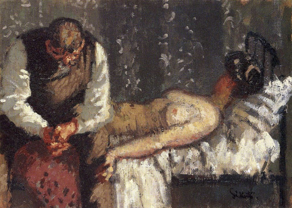
Last year sometime (maybe even the year before, the last few have been a blur) I picked up a fantastic oversized book called Pulp Art ($12.95 no less!). The image above is from the book, it’s a cover of Spicy Mystery Stories Magazine (oil?, 1936) by pulp artist H.J. Ward.
This pulp image in many ways seems like alot of the others that existed at the time. A dark villain, a dastardly deed, a gorgeous woman in peril, all the makings of the pulp art of the 20th century. But this one for me stands out, and there’s alot of things that point to a more thought out approach to art that Ward used.

The pulp artists, of course, were illustrating story images, so the covers often showed a part of a story in progress. In this image, I think Ward captured a great moment in time. It reminds me of Edward Hopper’s work, where we get to see that something’s about to happen or it just did. With Ward’s shot here, we get to see that something already happened, and something worse is about too. A nice moment of tension to draw the viewer (and the buyer) in.
The Pulp Art book has a nice “conversation” on the following page to this, and it makes alot of good points on what Ward really did here. It’s obvious that it shows a heightened sexuality present in the 30’s pulp art covers, but here there’s more to it. Before the time seen here, this woman has already been through alot. An arrow almost in the head stands out, but if you look closer (the book points this out, so I can’t take the credit) at her arm you’ll notice something subtle, but disturbing. Her arm is at an awkward angle, and in fact her wrist is already broken. The “posed” woman from the pulp covers now has real emotion, a broken woman who may get something even worse very soon.
I like how Ward used the layout to his advantage as well, as each object or design we see forces the eye right where he wants it. The orange/yellow background is a slice of light, bringing your eye through the evil and into the desperate woman. Angles help in art to allow the viewer visual cues to where they really should be looking, a technique that’s very valuable in comics. In this cover, Ward uses the technique perfectly, moving the eye where needed without forcing you harshly, allowing you to see for yourself.
I think Ward’s colors and tonal balance are great too. The colors pop off the page, something important for a book cover. No one’s going to buy a bland, tonally boring piece of art, and the same thing happens to an extent with books. If the cover jumps off the shelf at you, especially in a huge pile of other pulp novels, it’s going to get recognized.
The pulp artists are often forgotten in today’s world, and that’s unfortunate. Underneath the rough and tumble, highly sexualized stories, there was a chance to bring powerful illustrative art to the forefront. The pulp artists laid the groundwork for the fantasy artists of the rest of the century and beyond, and I think Ward’s cover here is a perfect example of the best in pulp art.
Opinions?
Russ