The origins of my 20-year art career were not that different from many other artists. I started learning the craft by seeking out inspirational artworks, and it is something I continue to do. Since I also enjoy writing, I took the advice from a friend that I should combine my writing skills with my desire to learn about art, and I began blogging about artistic masterpieces in the early 2000s. One of those blogs was about the famous painting, “The Icebergs” by Frederic Edwin Church. I learned a lot from the tiny image of the painting I found online, but I realized only later that seeing the original in a museum would be a far superior experience.
The transcendent experience of seeing an original piece of art in a museum is substantially better than any reproduction could possibly be. Online and printed copies are produced at different sizes, colors, and quality than original pieces, leading to inferior personal experiences that betray the intention of the artist. Seeing the original artwork in a museum offers reflection, education, and admiration that a reproduction can not provide. The unique crafting of the original artwork piques interest for further works by the artist, and similar artists and movements, far more than any reproduction can match.
Reproductions are inferior versions of original artworks
What I did not realize at the time of writing that blog was that reproductions, especially of large pieces like “The Icebergs”, will always be inferior to the original painting. The reproduction I used when writing the blog article was a decent size for an online image in 2009, and the article I wrote dealt with only the general details of the painting. The famous painting was reproduced in an identical size for an article in the Wall Street Journal (Figure 1), which went into far more detail about the creation of “The Icebergs”, the symbolism of the lost Franklin expedition as seen with the ship’s mast in the painting, and the feeling that the painting gives of being surrounded by ice and water14.
“‘The icebergs’ (1861) by frederic edwin church; frozen sublimity, louring sky” described standing in front of the painting and how everything felt, “enormous and eerie,” and seeing the “brush strokes and delicacies in Church’s composition.” Those descriptions are the ways I always hope to be moved by art, by not only the emotions of the complete work, but the methods that went into the creation of the piece. But it is an experience that the blurry, postcard-sized image used for the original blog and “‘The icebergs’ (1861) by frederic edwin church; frozen sublimity, louring sky” could never possibly reproduce:
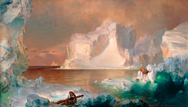
Figure 1. “The Icebergs”, http://darkstormcreative.com/images/this_weeks_art/Church_icebergs_600.jpg
After seeing the painting online for many years, and eventually writing the blog about it, I had this sense that I knew what it would be like in person. I knew about the blue stripe on the left, and the ship’s mast at the bottom. I could tell Church used high detail in some areas, but much looser, more fleeting brushstrokes in others. However, I realized how little I actually knew when I came around the corner on the second floor of the Dallas Museum of Art (Figure 2):
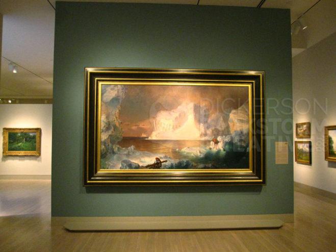
Figure 2. “The Icebergs” in the Dallas Museum of Art; photo courtesy Russell Dickerson
The Dallas Museum of Art lists “The Icebergs” as 64 ½ inches by 112 1/2 inches, 425 pounds6 of painting and frame that fill an entire wall. Imagine owning a common long-bed pickup truck, like the 2016 Chevy Silverado 3500. “The Icebergs” could not fit in the bed of the truck, even without the frame it would stick out 14” behind it and a foot over the sides4. “The Icebergs” is so large that “‘The icebergs’ (1861) by frederic edwin church; frozen sublimity, louring sky” detailed how the original owners donated it to the museum, as it was too large for their home. Figure 2 indicates the true size of the painting, and what I saw that day in the Dallas Museum of Art as I came around the corner. Seeing the brush strokes, the tiny details unavailable in any book, and the sheer magnitude of the piece was a magnificent experience that proved how little I knew.
The blue line that “‘The icebergs’ (1861) by frederic edwin church; frozen sublimity, louring sky” pointed out is difficult to distinguish clearly in the photo used in that article, but the advantage of viewers being in front of the original is seeing the paint strokes for themselves. Figure 3 shows that what appears to be a solid blue line is actually dozens of strokes, creating a rocky texture within the stone and ice surrounding it. In person, the translucency and shadows of the oil paint are apparent, as the light bounces off of each stroke differently as the viewer moves around it. It is a vibrancy lost with a smaller, pixelated web image that simply can not be reproduced online. As an artist, I couldn’t help but stare, inches away from the canvas, following the intricacy of the lines and strokes. Seeing the signature that Church added some 146 years before gave me a personal, intimate feeling of the great history of the painting, something that simply is not available in a reproduction.
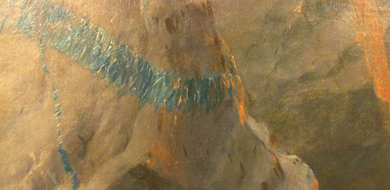
Figure 3. Closeup of “The Icebergs”; photo courtesy Russell Dickerson
Figure 3 offers a peek at details that are a little more intimate, rarely seen in books or most websites, showing off the ability of modern photography to capture intricate details that in past were only available in person. Having close-up photos can offer at least the capability for an online viewer to see details that would otherwise be hidden. Modern photographic technology and website programming, such as Google’s Art & Culture website10, can combine to bring high resolution details of a painting to online viewers. Google Arts & Culture uses Google’s Street View technology to bring the tiniest details of “The Icebergs” into view, a great feature that improves upon other blurred, tiny reproductions. The same blue line from Figure 3 can be seen in nearly the same detail using the features of Google Arts & Culture, and it may be the closest that the online world can get to the real piece in the museum.
What Google Arts & Culture offers, even being as close as it is to the details of the original painting, is still a half-truth at best. Google Arts & Culture can not capture the shift of light that the edges of each paint stroke throw off into shadow, or the translucency of the oil paint that mixes differently with the other colors as the user moves around it. As seen in Figure 2, “The Icebergs” is as big as a wall, and in person a viewer can watch the brush strokes of the blue line as they move to a different area, keeping the reference. By its nature, the zoomed in, yet high resolution version of Google Arts & Culture will always be cropped, only showing one section at a time on a monitor, tablet, or phone. The details might show Church’s general technique with the brush, but even an extremely high resolution, pan-able image can not reproduce the personal experience of how the paint adapts to the moment the viewer is seeing it in real life.
Reproductions can be higher or lower resolution, and different colors, than the original piece, an unintended, but important, loss of quality. Figures 1-3 of this paper are an example of the difficulty of effectively reproducing an original artwork. The bluish tint of “The Icebergs” from “‘The icebergs’ (1861) by frederic edwin church; frozen sublimity, louring sky” compares harshly to the yellowish tint of figures 2-3, themselves a failure of digital camera technology in 2009 when they were taken. Compare those to Google Arts & Culture, a far more muted version comparatively. Colors and resolution can both combine in a shift to the worst, as a reference for this project, “The Icebergs: Arts & Activities”5, showed a disastrous mess of “The Icebergs.” As a visitor to the Dallas Museum of Art on several occasions, I would say that none of the reproductions are correct, as there is a loss of clarity, vibrancy, and color in any of the reproductions. I look back again at the original blog, an article that I felt I wrote well, and re-evaluate how I really feel about the painting. Since I based the article on an inaccurate reproduction, the ideas I wrote about, and have passed on to my readers since 2009, might not be based in reality, or describe what the artist intended.
Betraying the intention of the artist
Inaccurate reproductions of art can betray the intentions that artists had for their works. Artists use their passions to create original art, with the intention of offering the viewer a unique vision and experience. As an artist, I spend a good deal of time determining the best way to approach my work. Coming up with the original idea is just the first step. I also have to consider which medium would be best to explore the idea, materials to use with it, and the size of the work. Imagine how insignificant a landscape would be on a postcard, or how ridiculously terrifying a wall-sized closeup of a single human eye would be. I also consider if I want to paint in a lot of detail, or leave the brush strokes more open. All of these thoughts, and many more, are planned in an effort to get a reaction emotionally from the viewer. “Precisely These Objects” described how Church used details, and the lack thereof in some areas, along with physical size, to require that viewers see the painting up close, in person, and in the right environment12. According to “Precisely These Objects”, “ice, water, and looming bergs were all meticulously rendered” in Church’s “The Icebergs.” Church painted “The Icebergs” at a massive size, with specifically chosen effects and colors, that look nothing like the tiny, blue-tinted Figure 1 from “‘The icebergs’ (1861) by frederic edwin church; frozen sublimity, louring sky”.
As an artist, when I choose certain effects, details, and colors, those choices promote the ideas and emotions that I want the viewer to have. I want my vision to be clear, and to show the craftsmanship that the many hours needed to create my art requires. Reproductions of the lines of my inks, for example, can not equal the subtlety of the thousands of lines I use. Prints and online versions might show only blurriness instead of sharpness, and that perceived, often unintentional loss of quality can impact the reputation I have as a draftsman and artist.
Even the perceived reputations of famous artists can be butchered by bad reproductions. “What are we seeing, exactly” elaborated on blurriness and quality of reproductions that look nothing like the original masterworks of Rembrandt van Rijn. “What are we seeing, exactly” compared samples of what the author considered the best reproduction of Rembrandt’s “Jan Six” painting, with scans, slides, and versions from other books. In places where Rembrandt created hundreds of marks, comparisons showed marks that were toned badly, blurred to the point of looking like a wash, or completely gone8. “What are we seeing, exactly” noted that fine details, even the texture of the paper that appeared in the original work, were completely gone in the reproductions. Rembrandt’s incredible details, and his intentions for the piece, were lost in a haze of inaccuracy.
Inaccurate reproductions can damage the real sense of what the original piece was like, and sometimes only gives a partial sense of the original. “Digital archive project to catalogue exported Japanese decorative arts” described the influence and importance of Japanese decorative arts on the history of Western applied arts. Though copied frequently, “Digital archive project to catalogue exported Japanese decorative arts” found that production of the 19th century Japanese objects they were adding to a museum database were rarely reproduced well, adding that, “Their visual appearance transmitted Japanese aesthetics and design, and their production was imitated, but seldom surpassed.” Despite the enormous amount of accuracy and work that went into the project, “Digital archive project to catalogue exported Japanese decorative arts” conceded that some information about the decorative pieces could not be transferred via photos, such as perceived proportions, balance, and the feeling of the texture on the surface. Much like Google Arts & Culture, the techniques and general ideas are available online as described in “Digital archive project to catalogue exported Japanese decorative arts”, but the project can not account for the experience of the decorative objects in person.
Printed art books can often pass on the general ideas of art as well as online sources, but inaccurate colors can still throw off the artist’s intent. The cost of printing in color may have been too high to print every page in color, or different editorial choices made, leading to images that are misrepresented. “Frank Schoonover, illustrator of the North American frontier” covered many of the paintings that illustrator Frank Schoonover created over the years, producing some of the book in color and some in grayscale. Figure 4 shows a comparison of the color image featured on the Schoonover website9, with the comparative colorless version that appeared in the “Frank Schoonover, illustrator of the North American frontier” collection. The color accents in the characters, and in the environment around them, could be interpreted as the artist’s intent to highlight or even downplay certain areas of the image.
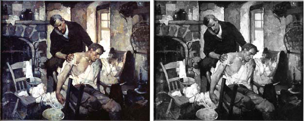
Figure 4. comparison of the Frank Schoonover website and “Frank Schoonover, illustrator of the North American frontier”
There are works in “Frank Schoonover, illustrator of the North American frontier” that indicate that the artist did sometimes only paint with black and gray, and in choosing color for the work he had clear intentions for his piece. In this particular painting, Schoonover’s use of color seems to draw the eye exactly where he wanted it to, working with the contrast of the highlights and shadows. He used warm colors to keep the viewer’s eye in the center of the piece, specifically around the man in the chair. From the tan colors above him, to the green bowl beneath, Schoonover kept the viewers eye fixed where he wanted it, and allowed the colors on the left and right to be more dull, and less important. In only grays, the painting loses coherence. The eye can wander wherever the brightest or darkest spots are, jumping from the window, to the man, over to the empty chair, and back above the standing man’s head. The viewer’s focus, and the artist’s intent, is lost. Showing only the gray version gives us just half the story, a loss of what the artist really meant.
Reproductions can not match the unique experience of the original
A reproduction can show the general idea of art, but it can not offer the unique experience of reflecting on the full story that an original piece offers. Original artworks feature textures, lighting differences, and environments evoking the emotions that the artist intended. As figure 2 shows, “The Icebergs” is not just a gray postcard in a book. It is a massive wall of color and texture, one that stops museum patrons in their tracks to admire it. Viewers work from one side to the next, taking in the painting’s details, craftsmanship, and even framing.
As I walked from one side of the painting to the other, I became not only enamored with the painting, but with the frame and the presentation of the piece itself. As Figure 2 shows, “The Icebergs” takes up its own wall, and immediately grabs the attention of anyone near it. Along with its massive size, the thick frame around it separates the space within from the outside world. It creates an effect much like a window, and the delectable experience within the museum environment shows the importance of how to frame a painting.
“American artists’ frames” detailed the importance of framing a piece of art, and meanings behind the methodology. Based on discussions of pieces in “American artists’ frames”, the size of the frame and the surface of it give the viewer a sense of the grandness of the piece, and still contains the open scene within it. “Precisely These Objects” explained the value of “The Icebergs” to Church, and choosing the right frame would have been essential for appreciation of the painting. Positioned alone on its prominent separate wall, the experience of Church’s original painting far outweighs what a print or a website could accomplish.
The experience that the Dallas Museum of Art offers falls well in line with the points made by both “Art in Time and Space” and “In the white cube” found that those surveyed found more interest and happier feelings viewing the original pieces in a museum, as opposed to seeing copies on a computer screen in a lab. “In the white cube” found similar results, including participants that were interested in getting further information about related art and artists. As with personal experience from figure 2 at the Dallas Museum of Art, “In the white cube” found that participants looked for new art and more knowledge after seeing the original piece within an effective museum floor design.
When I visited the Dallas Museum of Art and experienced “The Icebergs”, the way in which the museum’s floor layout was designed led to a view of the painting that bordered on magnificent, and something that could not be recreated in a book or on a website. As Figure 2 shows, the massive size of the painting filled my entire view as I came around the corner, and the presentation of the painting is something that I remember to this day. “In the white cube” described that if a piece is in a unique setting, it is easier to remember. The actual space a painting is in, as I experienced with “The Icebergs”, makes it far more memorable and authentic than just another reproduction on a monitor3.
In talking about original pieces and authenticity, “What’s Wrong with an Art Fake” described the lack of value and uniqueness in reproductions. As reproductions have no real uniqueness, the perceived value is lessened in both thoughts and emotions16. The original retains the artist’s craftsmanship, and offers a more emotional experience. “Pictures in Pictures” detailed similar results with schoolchildren, when asked about the preference of an original Seurat painting over the reproduced version illustrated in a book. The children responded that they, “preferred the detail and creativity that went into the creation of the original”17. The original offered the students an impact that they did not feel with the reproduction, and seeing the original in the museum, no matter how well done the illustrated copy was, offered more emotion and interest.
The participants of “Differentiating between reproductions and original artworks” echoed the sentiments of the children discussed in “Pictures in Pictures”. “Differentiating between reproductions and original artworks” featured student surveys of original art and reproductions, and many of the responses in favor of original art were worded more personally, imaginatively, and discussed more of the senses in the experience. Original pieces meant more to the students, in quality and emotions, and they described their feelings about the original art more passionately than with reproductions15. “Differentiating between reproductions and original artworks” explained that students’ ability to know an original from a reproduction was, “essential to inspiring life-long learning in the visual arts.” Visual art standards are becoming increasingly important for students across a number of states, and New York’s standards expects successful student plans to see original art at museums, and discuss differences between original and reproduction pieces15.
Conclusion
Since experiencing “The Icebergs” in 2009, I have had several opportunities to see other paintings that were previous favorites of mine from reproductions. I stared in wonder at the intricate brush strokes of Norman Rockwell’s “Young Lady With the Shiner”, mysteriously in the modern art section of the extraordinary marble halls of the Wadsworth Atheneum. I saw the sadness in Gustave Dore’s “La Famille du Saltimbanque: L’Enfant Blesse” at the Denver Art Museum, marveling at how a master engraver can adapt techniques from his intricate engraving work through brush strokes. I can chuckle at the tiniest of details in N.C. Wyeth’s “Young Benjamin Franklin” at the Amon Carter Museum: upon very close inspection, I could see that Wyeth painted Franklin with patched socks. Be it Rockwell, or Church, Wyeth or Dore, the original art shifted from seeing a vision to truly experiencing each piece.
Seeing an original piece of art in a museum is a unique, transcendent experience, substantially better than any reproduction could possibly be. With reproductions being produced with the wrong resolution, terrible and inaccurate colors, and of bad quality, the experience of seeing reproduced art betrays the emotion and intent that the artist wanted to create. The original artwork can educate about techniques, colors, and even movements within art history. Original pieces offer admiration of the artist, and reflection for the viewer, in unique and environmental ways that simply are not possible online or with printed reproductions. To truly see artwork, to find the experience that the artist wanted the viewer to have, finding the original piece of art is the best way to live through artwork.
References
- Bincsik, M., Maezaki, S., & Hattori, K. (2012). Digital archive project to catalogue exported Japanese decorative arts. Journal Of Humanities & Arts Computing: A Journal Of Digital Humanities, 6(1/2), 42-56. doi:10.3366/ijhac.2012.0037
- Brieber, D., Nadal, M., & Leder, H. (2015). In the white cube: Museum context enhances the valuation and memory of art. Acta psychologica, 154, 36-42.
- Brieber, D., Nadal, M., Leder, H., & Rosenberg, R. (2014). Art in Time and Space: Context Modulates the Relation between Art Experience and Viewing Time. Plos ONE, 9(6), 1-8. doi:10.1371/journal.pone.0099019
- Chevy Silverado. (2016). Chevy Silverado Specs. Retrieved from http://www.chevrolet.com/silverado-3500hd-diesel-trucks/specs/trims.html
- Church, F. E. (2015). The Icebergs. Arts & Activities, 158(4), 45.
- Dallas Museum of Art. (2016). The Icebergs. Retrieved from https://www.dma.org/collection/artwork/frederic-edwin-church/icebergs
- Dickerson, R. (2009). Russ’ art blog: The Icebergs. Retrieved from https://www.rhdickerson.com/2009/02/russs-art-blog-frederic-edwin-church-the-icebergs/
- Elkins, J. (1997). What are we seeing, exactly? The Art Bulletin, 79(2), 191-198.
- Frank Schoonover. (2016). (1487) “locker”, shirley murmured. Retrieved from http://www.frankschoonover.org/1001-2000/1401-1500/1487-qlockerq-shirley-murmured/
- Google Arts & Culture. (2016). Frederic Edwin Church. Retrieved from https://www.google.com/culturalinstitute/beta/asset/the-icebergs/vwETKwU44c-H0w?ms=%7B%22x%22%3A0.08126542441278331%2C%22y%22%3A0.43862163286739864%2C%22z%22%3A12.500004806652287%2C%22size%22%3A%7B%22width%22%3A0.15880089282224552%2C%22height%22%3A0.23799388555983858%7D%7D
- Older, C. D. (2007). American artists’ frames: Paintings, environments, and viewers, 1860–1920 (Order No. 3285840). Available from ProQuest Dissertations & Theses Global. (304881270).
- Raab, J. (2013). “Precisely These Objects”: Frederic Church and the Culture of Detail. Art Bulletin, 95(4), 579. doi:10.1080/00043079.2013.10786094
- Schoonover, F. E., & Schoonover, C. (1976). Frank Schoonover, illustrator of the North American frontier. New York: Watson-Guptill Publications.
- Spiegelman, W. (2012, May 11). ‘The icebergs’ (1861) by frederic edwin church; frozen sublimity, louring sky. Wall Street Journal (Online) Retrieved from http://www.wsj.com/articles/SB10001424052702303404704577305800463001274
- Uscher, D. (2011). Differentiating between reproductions and original artworks: The influence of style and sequence (Order No. 1491342). Available From ProQuest Dissertations & Theses Global. (865624975).
- Wolz, S. H., & Carbon, C. (2014). What’s Wrong with an Art Fake? Cognitive and Emotional Variables Influenced by Authenticity Status of Artworks. Leonardo, 47(5), 467-473. doi:10.1162/LEON_a_00869
- Yohlin, E. (2012). Pictures in Pictures: Art History and Art Museums in Children’s Picture Books. Children’s Literature In Education, 43(3), 260-272. doi:10.1007/s10583-012-9170-7