Most people that know me outside of family (both of you, you know who you are) know me as an artist. But by day, and sometimes even at night, I am also a graphic designer.
Sometimes that means signs, or books, or even logos, which is the topic for today. I created a logo for a client last night, and interestingly she asked what the ideas were behind the logo. To be fair, the client did give me a good, if not nearly exact direction to head in. But I came up with something a bit more abstract, and she was interested in how I thought of it.
Now, with art, I normally don’t have an answer for that. Other than of course with story illustration, where the art is based on or at least influenced by the story. I’m not a fruity “artiste” with a mission statement and such either. Usually my answer is, and truthfully so, that I did it that way because a) that’s how it needs to be produced to look right or b) I thought it looked cool.
“Cool” is almost always the reason.
Of course there’s more than that. There’s an understanding of how a piece will produced in the end, whether that’s on the web, in a book, on a coffee cup, and so on. There’s also experience, I’ve been doing this for a long time (design especially) and there’s a knowledge from the past on how it should work. There’s hopefully some part of my brain as well that might have a smidgen of talent at these sorts of things, at least I hope that’s true.
But being asked, “why”, I decided that maybe I should examine why I created it as such. To be fair, the client hasn’t picked a final version of it, and this is #1 of 3, so, grain of salt.
So, here we go.
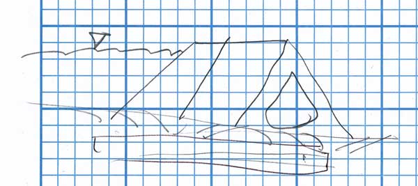
This was the original sketch from the client, basically as an engineer they work with water, dams and making it so people that need either can get it.
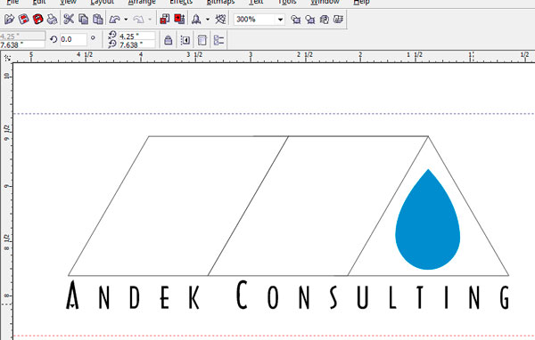
Here’s the beginning, a rough vector version of the exact idea. It’s a vector for a number of reasons, but mostly because it will be used in various things at various sizes and needs to be crisp no matter what (embroidery especially). It will also only be 1-3 colors, so simplicity is perfect.
There was no real idea of fonts or anything, and I tend to take my dear sweet time finding them. I tend to have a general idea of what I want, but I also waste a fair amount of time looking through all my fonts for the “right one”. Mostly that’s because I’m a pain in the ass and far too picky for my own good.
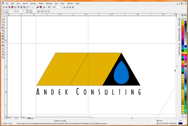
Here’s a more finished version, with a better font and an added color. The color will show up well with the blue, and add a little to it. But I also thought at this point that it’s kind of boring, and not really very representative at all nor does it pique the interest. So I started fooling with it.
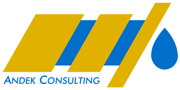
This is the quasi-final version (there are always client changes–always), and it’s far more abstract than the original idea. I think it’s also more interesting and dynamic, and would be better at catching someone’s eye than the other version.
When she asked me earlier about the ideas, I gave it some thought and emailed her back. I think it’s actually a pretty good answer, so here’s what I said:
“The top one [note: again, there were three of them, the first two looked like the original idea] holds to the slanted dam wall idea that John started with, but makes further use of the left riser part of the “A” to make more of an idea that the water is being held back, and released in a controlled way as only the single drop. The blue that appears to the left of the drop, behind the gold, indicates the water flowing behind the dam but being stopped (or converted) by the “A”.
Inadvertently, the overall design also is similar to a drill, which may or may not fit in this case. It doesn’t have to read like that, but I thought it was an interesting side effect. I also left off the background behind the “A” for a more dramatic effect., letting the left riser and the blue drop show it off.
I thought the gold complimented the blue well, and is lighter (and less emotionally ‘heavy’) than using something like black. I chose more of a gold over pure yellow more because it would show up in printing/embroidery/etc. better, but also because the color could give indication of earth or some other material other than water. It’s also not as graphically uninteresting as a gray concrete or gray-brown dam would be. ”
Well, there’s an insight into the design of that logo. It may not be the one that’s used, or it may be tweaked, but I thought the “why did you do it” question was interesting enough to post.