Now, fair warning, the image I’m about to present is of a scene in author Brian Keene‘s recently released novella Scratch, and may contain a bit of a spoiler.
When I go to make a print of something to sell, I tend to revisit what the piece looks like. If it’s a color piece, I usually just make sure it will print correctly and move on. In the case of grayscale art, often I’ll look at it and see if I can enhance it with color.
Most of the time, I’ll give a grayscale piece a “duotone” effect if I think it will make it better. Not always, but just when I think the piece will be better off with a touch of color than just the black, gray and white colors by themselves.
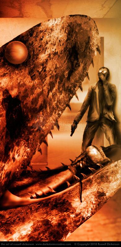
I only very rarely make a grayscale piece a full color work, as I approach full color work in a different way (mostly in my head). The image below, from author Brian Keene‘s recently released novella Scratch, has had a couple of additional colors added, but not the full range of colors, and I think it adds a little something to the mix.
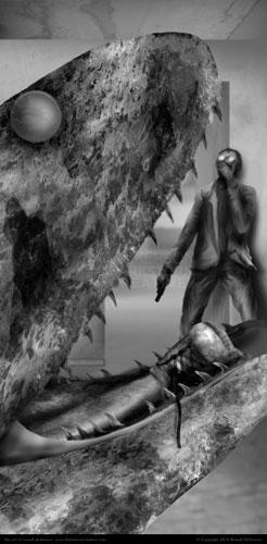
Here’s what the initial image looks like, and in fact it’s how it was printed:
Though the image itself (called “nasty” by friend and fellow artist Kirk Alberts) is a bit of a shock, there’s also some subtlety involved. In fact, I’ve had to point out the leg and foot in the snake’s mouth to several people.
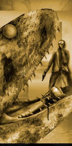
So, in Photoshop, I duplicated this layer and, using the “Hue/Saturation” adjustment (you can do this a number of different ways), I added a sepia tone to it:
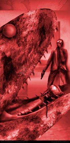
It’s actually not bad at this point, and in fact on many pieces I’ve stopped here and printed it. But, being big into experimentation, I thought I’d try a magenta version as well. So, duplicate the layer again and repeat:
Now, this version is.. shall we say… “girly”.
That magenta is way too strong, but if we work with the sepia and the magenta using masks and layer blending modes, we can turn it into the final piece:
By manipulating it in Photoshop, with really only a couple of colors (and black of course), we have a piece that feels far more aggressive than the grayscale one did. This one (I think anyway) gives you a false sense that there’s really more gore here than is depicted, and strikes home the horror of the moment.
I could spend the time to color every part, to really make each individual part into a color work. But for me, this might actually be stronger. The viewer’s mind starts filling in the gaps of color, making them often see what’s not really there.
It’s no more bloody or gory than the grayscale version, but it has a certain impact that the grayscale does not.
Opinions?


