Now, before we begin, let’s just say that my years of being an engineering student are way, WAY behind me.
But I was looking at a couple of sites today that discussed the Golden Ratio or the Fibonacci Spiral, a quasi-magical scientific idea (let that roll around in your head for a minute) by which supposedly “better” or “more pleasing” art can be developed. The spiral is better defined on other sites, so I’ll wait patiently while you Google it.
… all done?
Now, I don’t discount such ideas, including the rule of thirds, the rule of not centering your work, those kinds of things. I think they have their place, and if anything over time the artist learns them subconsciously anyway. But after looking at a few examples, I thought, since I’d never done it with my own art, what my work might look like with the Golden Ratio applied.
This is by no means scientific, and is probably flat out wrong in implementation. But I thought the results were interesting, and I’m bringing them here to you fine folks (or is it “folk”, are you the only one left?) to see what I came up with.
Since I could creatively crop any of my pieces to fit the right square proportions, I didn’t think that was fair. Since many of my works have to fit specific, defined print sizes, the cropping would be, I think, cheating. So I decided that mathematically it should be the same ratios on a piece regardless of final proportions, and “squishing” them to fit the rectangle would be more honest.
Let’s face it, I’m an artist, not a math whiz. So if you don’t like it, go read about the Riemann Hypothesis, you don’t need an art site anyway.
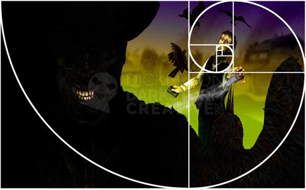
Here’s the first one, my recent (squished!) cover of Brian Keene’s book A Gathering of Crows:
Levi is dead shot on the spiral.
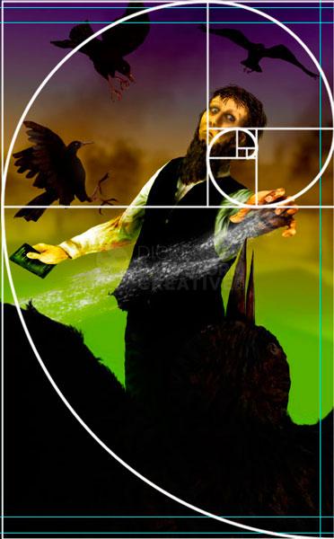
Also, his hand is right at one of the cross marks, and the birds somewhat follow a curved path. Interesting. Then, just for giggles, I set the rectangle to only show what will print on the very front cover (it’s a wraparound), which proportionally is about the same as the rectangle (not squished!):
Which is even more interesting. Even turning the spiral, Levi’s hand is still at a cross. The tips of the crows’ wings nearly all meet on the spiral line. The flow of the piece, where the dark and light areas run, seems to follow the line fairly well.
Huh.
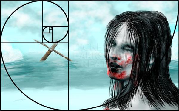
I most certainly didn’t plan it, and I don’t really know what it means. But let’s take a look at another piece, my work A Violent Reaction (squished!):
Now, this piece was less planned than the Crows cover, as it was more of a catharsis piece that just needed out of my head. So, that it’s only close to the line, not right on it, would probably be expected. But the mast isn’t far off center, and the angle of her jaw corresponds pretty decently with the spiral line.
Very interesting.
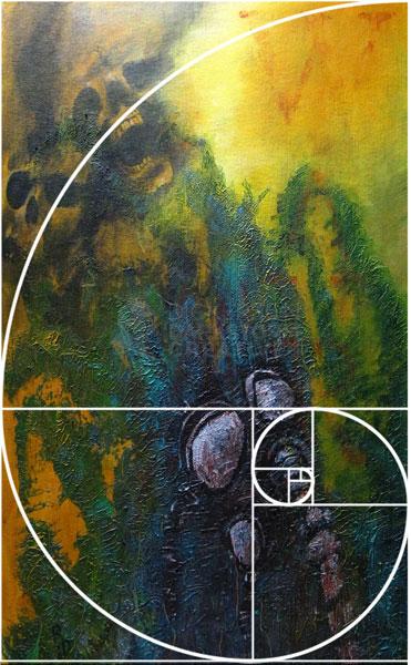
I decided that, since I do so much digital work, maybe I should look at how it works out with my far looser acrylic paintings. Here’s Apotheosis of War (squished!):
That one I can’t explain.
See, on this piece I changed my mind plenty of times, until I thought that it was “right”. No measurements, no sketches, just slap paint at the canvas and hope for the best. But the center of the mask is right on the spiral, as are the skulls and even the bright highlight in the yellow. The rough, blue-green texture even more or less ends within the border of the spiral.
Again, huh.
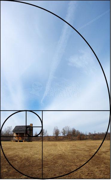
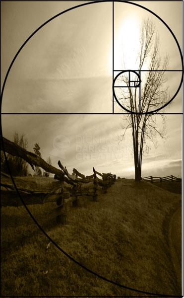
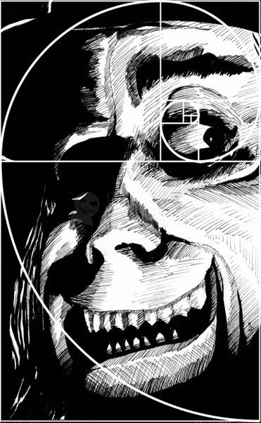
Here are a few more (squished!), an ink and a couple of photos that I’ve taken. While I don’t think any of my works are right on the money, it’s very interesting to see that some of them aren’t far off at all. I’m not honestly sure what that means, but I do think it’s fascinating.
Opinions?
