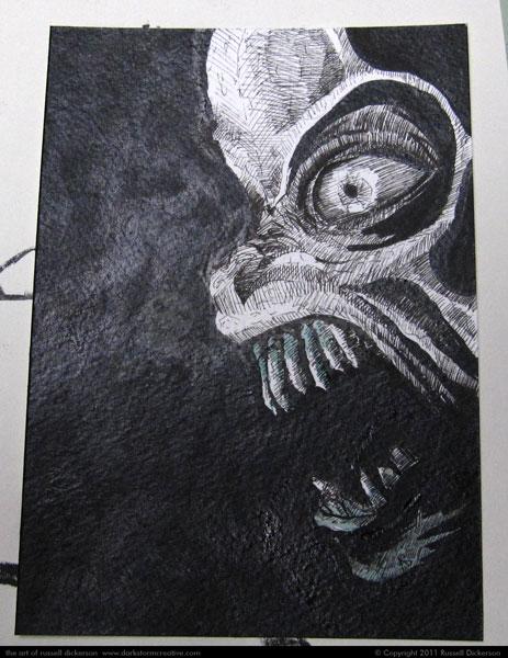
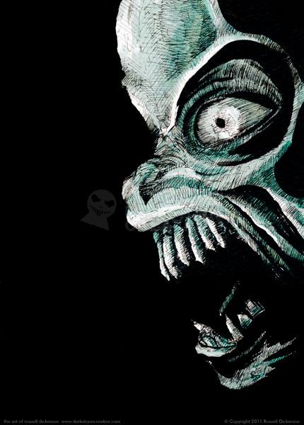
I’ll be a guest at VisionCon next week in Springfield, Missouri, and I’m trying to create more art to show (and sell there). I’m also having fun doing these ink cards, it gives me more confidence going into larger pieces.
I’m also getting good practice working from a photograph (or a series of them), which I haven’t done much in the past. Most of the time, I’ve just pulled things from my head. But I think if I base every image off of something in my head, I might lose a sense of what something really looks like in real life. Lighting, position, environment, these are things I can come up with in my head, but they are only what I know inside that works.
Of course, picking movie characters and monsters means that it’s lots of fun too. This particular one is the titular character in the film version of The Twilight Zone, the actual Nightmare at 20,000 Feet. I think the design of this particular creature was brilliant, and it’s been stuck in my head since I saw it as a kid.
I also decided on this entry to add some process, as a few people said they like to read blogs like that when I have them. So, here we go.
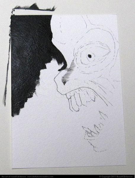
Starting is often the hardest part, and this case was no different. I ended up roughly inking in the character, and then decided the best place to really get going would be the background. That’s how it works sometimes, and I just let it flow. I’ve learned (through many battles with myself) not to fight what wants out first.
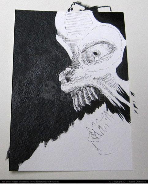
Next, I added more black to the background, and started adding in details. I still tend to jump around a bit on most works, though on occasion I do things in “order”. This wasn’t one of those cases.
This is also a good example of where I change my mind sometimes. I decided that I needed to use the brushed in ink more than I had been, so I ended up brushing in ink even in areas that I might have simply cross hatched before.
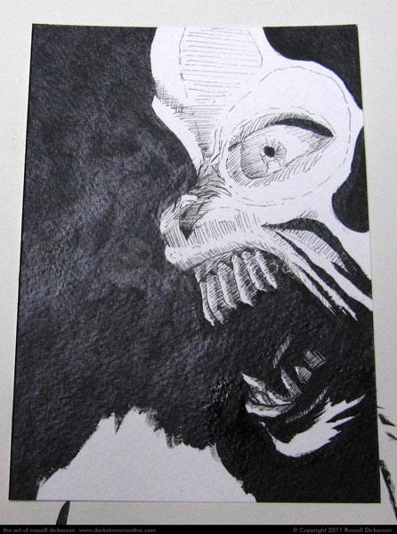
You’ll also notice that I still haven’t filled in that white area on the lower left. That’s not because I’m lazy (well, not ONLY), but because leaving that area alone gives me a place to rest a finger or my hand, often to hold the paper from shifting around. I know full well it’s going to be filled with black anyway, so I can catch up with that later.
After brushing in more ink, I also spent more time crosshatching various parts of the image. I have a tendency to crosshatch areas across the whole image, then I stop and look at it. Then I go back through and add more crosshatching to areas that need it, that maybe stand out too much.
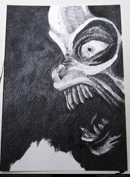
It’s at this point that I decided to experiment with it some. I think it’s important as an artist to experiment, and in this case I decided to use some color ink to give the image a little something else. Now, to be honest, I can color this digitally. In fact, I’ve done that before, plenty of times. But this idea with the ink cards is to go back to traditional media, to learn more from it and get better at it, so I need to stick with traditional means.
I picked somewhere small, in the teeth, to see if it looked ridiculous.
After it seemed like it would be fine, I expanded the color to the entire work. Whether I succeeded or not is ultimately up to the viewer, but I’m happy with how it turned out. What do you think?
