I had fun digitally coloring The Pale Man ink that I did (see it here!), and I thought I’d try it again. I’ve been away from inking for a couple of weeks, due both to the job search and some paying gigs, but I created a new one today for sale.
I have numerous ink ideas, based on various creatures and characters, that I want to do. Their purpose has been, since the beginning last year, to ground my work a bit more than it has been. By at least starting with a photo (I end up straying quite a bit), I’m hoping to learn a better sense of real world lighting, characterization, and just a more measured approach to art.
Is it working? Whether the art is any good or not is up to you, but as I’m doing digital art for projects I’ve noticed already that certain steps are already easier. It was a much better organized attempt to do even digital work, so I think in some ways the ink works are helping me with my techniques.
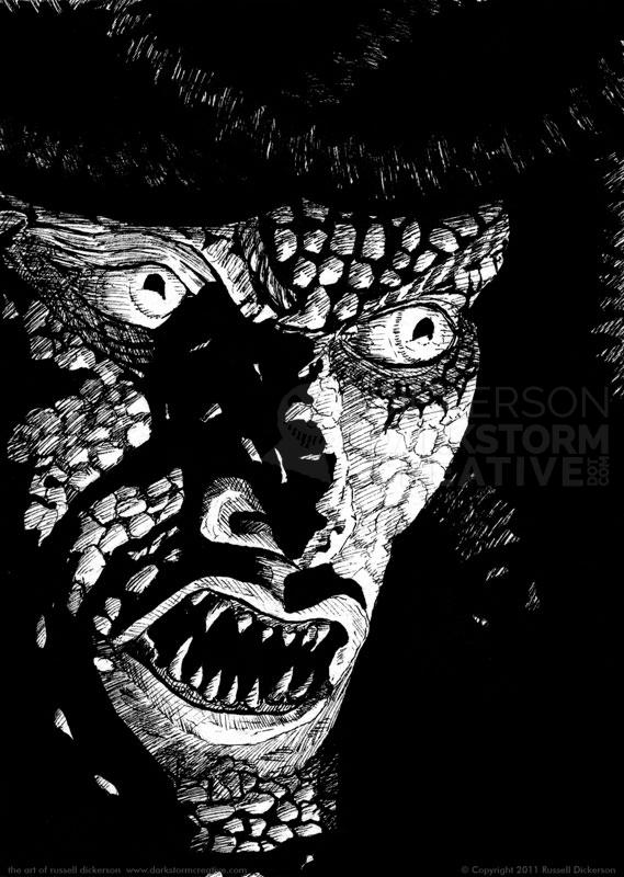
After a bit of internal debate, I decided on the new ink to try. This is based on the Gorgon/Medusa from the original film version of Clash of the Titans. I liked the old design far better than the crappy 3D version the new one has, and I’m sure much of that has to do with Ray Harryhausen, designer of the original.
I never just do a straight copy of the photo, I always stray to some extent. I’m not trying to learn how to copy things, I’m trying to learn from the images themselves after all. But I do hope that I capture the intent of the image, and the sense of the creatures or features in them.
First up is the original ink version. As with many of the others, this one is ink on 5″ x 7″, 140 lb. Cold Press.
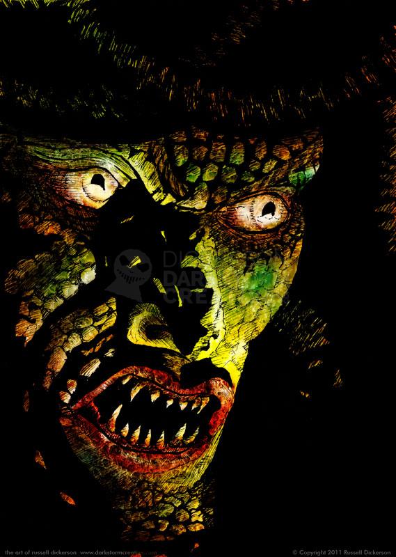
After I finished it, and after dinner and general family excitement, I decided to digitally color it in Photoshop. Now, my procedures probably break all the coloring rules, but hey, it’s my art after all.
Basically, the ink sits on the top layer, with it’s blending mode set to “Multiply”. This gets rid of the white, and all or most of the grayscales, to allow the color underneath to show through. Next, I put a simple gradient under it all, to give it a basic look. Then there are layers of airbrushed color in various spots, for effect. Last but not least, there are a couple of texture layers to give it a little more “oompf”.
Let me know if I succeeded or not, but from my point of view here is a scarier, meaner looking Gorgon:

