Sometimes when I’m thinking of doing some art, I get a good idea going. Some concept, or some particular scene grabs me and I want to get art made of it.
Today was no different, as I’d had an idea for another ink work based on some old noir films. I thought that not only would it be fun to try, but there would also be the challenge of texture again like the Lorre/M piece.
So I started in working on it, and, actually, it wasn’t too bad. But, as with all things, the little issues started to bug me, and I started getting dragged into the old “you’re not good enough for this” thought pattern. Which, believe it or not, isn’t a great thing to let start.
Right about then though, a natural break in the day happened. I had to go pick up one of the kids, so on the drive over there I let the art simmer in my head some. After the steam filled the car (get it… yeah, it’s terrible), I started getting this feeling that maybe I should try something drastic.
It occurred to me to deviate from the photo, far more than I had been previously.
Now, if you check out my last blog (here!), I posted the differences between the ink art I’ve been doing and the photos that inspired each piece. I vary quite often from the photo, and in most cases, while close, all of them have a uniqueness to them that’s not just a copy of the photo.
To be sure, there have been a few of the other inks that I started with a photo, and then, upon noticing that I wasn’t really that close to the original, made it my own thing. But this case was different. Had I continued, it eventually would have come around and worked out decently.
But I decided to destroy it anyway.
I suppose “destroy” is a bit heavy handed, as I didn’t really destroy anything. It wasn’t even done yet, only halfway. But I still decided that, frankly, if I wanted to play it safe then I shouldn’t even be doing art.
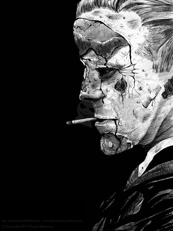
So, the other ink pens came out. Death wrought its ghost upon the art.
I do like what I ended up with, but I’m not sure exactly what it really is. It’s still kind of a noir piece, but it’s mostly definitely horror as well. I’ll let you fill in the blanks of his story, but for me, I call the piece The Hard Night.
It’s ink on 140 lb. Cold Press, about 9″ x 12″. I also did some ink wash with it, to give it some dimension.

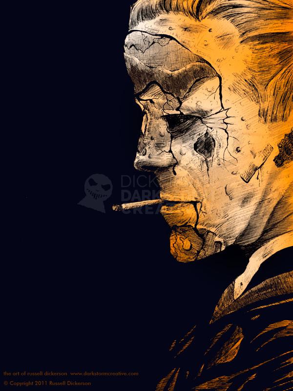
While I was in there, I decided to toy around with color (natch). This time, much like the Pale Man piece, I ended up with a color version that I may actually like better than the ink version. It’s a tough decision, but I’m very happy with how it turned out. A different color scheme than normal, but I still like it.
