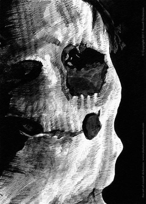
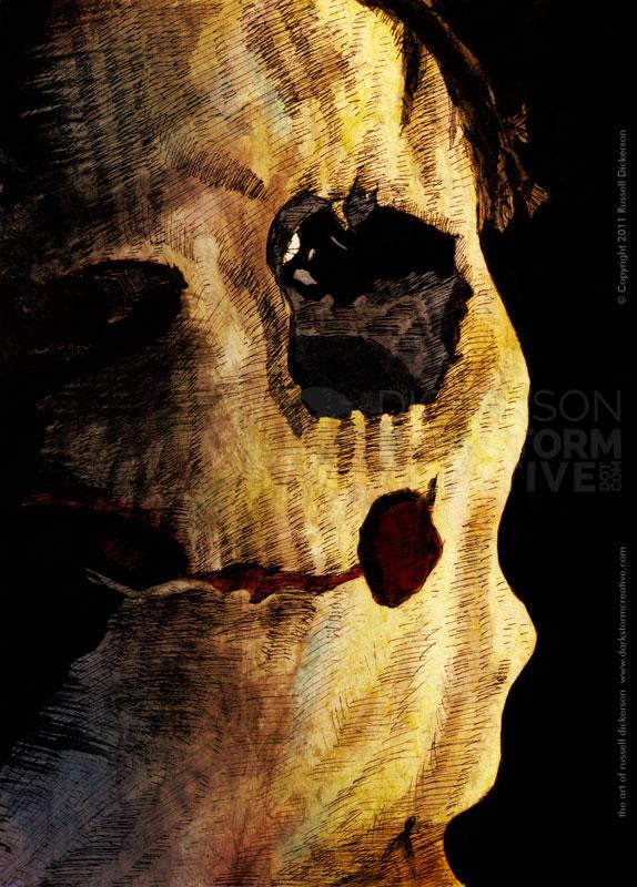
It’s not really a well-kept secret that I like the scary stuff. So, when I was looking to create a new ink work for the end of the week, I ended up with a scary figure.
Now, in this case, it may or may not look that scary. The character is Tomas, from the film The Orphanage, and, near the beginning of the film, this child comes up. I won’t give you any spoilers, but it is a pretty creepy character.
I decided to do things a little differently with this one. Instead of crosshatching first, I decided to do some ink wash first. I added just a few lines for rough areas, then brushed in the full black areas. Then I did the ink wash.
For those who don’t know, ink wash is a technique of watering down an ink color, often with water. Various shades can be accomplished through either different percentages of water, or through layering the same wash on top of other layers.
Here’s the original ink:
As is often the case, I also decided to run the work through Photoshop, to add some color and texture to it. I think each of these that I’ve tried that with stands apart from the original ink versions. But the color is nice in that it gives it a little something extra.
Here’s what I ended up with after Photoshop was done with it. I think it turned out well, and coloring it digitally allows me to really play with color and nuance, and change my mind if something is too drastic (or not drastic enough).
As always, opinions are welcome.

