While I was in Austin, Texas, for the World Horror Convention, I had a bit of time to kill before checking in. I decided to sketch some things first for projects that I have in play, and after that I decided to create another ink card.
Now, the main motivation for it was that I simply wanted to do another ink work. Secondarily, especially since I was sitting right near the main path of all of the con traffic, I had quite a number of people walk over and take a look at what I was working on.
As an artist, it certainly is a fine balance between marketing yourself and just being an artist. To be successful, promoting yourself is a must, and there are many people interested in how things happen as they are being created. Inking or painting (or whatever it is) in front of them gives them a chance to see behind the curtain and how an artist really works.
In a way, it does take some of the “mystery” out of creating art. People can see exactly how it is done, down to every line that I put on the page (I would imagine they have better things to do). They can literally see you put everything out there, including every mistake, and see how it comes out at the end.
What I’ve noticed though, having done live art at local gallery openings, shops, and cons, is that people get a different respect for you when they see what you are doing. That is especially true when they see the final product (if it’s any good). But it seems to come across as almost a proof that you can really do art.
In this day and age of powerful computers, software, and the internet, I get where they are going with this. I’ve seen plenty of art that is, to the trained eye (and untrained many times), simply a photograph that has been run through Photoshop’s filters. So, when they see an artist truly creating a new piece right in front of them, it becomes a real, true item. It’s something they can prove, and they (seemingly) have more respect for it and for the artist.
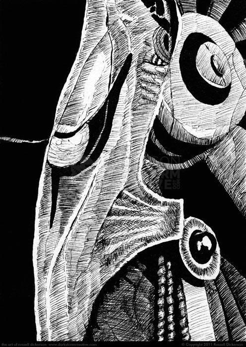
Below is what came out of inking in front of folks, the character Anubis from the film Stargate:
Now, personally, I liked how the ink came out. I thought it was very close to the character, but it’s also one of those inks (that happens in a lot of ink art, not just mine) that the contrast isn’t enough for the eye. On a larger piece of the watercolor stock (140 lb. Cold Press) I would have created much more black in the background, and kept Anubis to one side. As is it, on the 5″ x 7″, there’s not enough room to do that, so I chose an interesting crop instead.
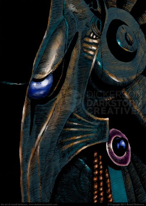
As is often the case, I also decided to color the work digitally, so I scanned it in and went for it. Often, I tend to prefer one version or the other, and sometimes I just like them both for their unique ideas. But in this case, I’m leaning toward the digitally colored version. I think the color forces the eye to go where I want it to, instead of taking in the entire work.
I’ll leave it to you on which you like better, but by all means let me know. Here’s the color version:

