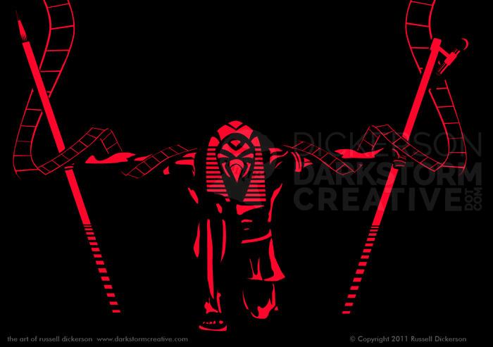
A good friend of mine, Weston Ochse, just released a fantastic collection of stories, called Multiplex Fandango. Published by Dark Regions Press, Multiplex Fandango is filled with great stories, and I highly recommend picking one up as soon as you possibly can. Go here to do so.
Now, you might be asking, why am I selling Weston’s book on my own site? Simple. Weston is awesome, and a great author. Also, because I was lucky enough to work with Dark Regions Press on the foil stamp for the hardcover edition. They were fantastic to work with, and this project presented a number of great challenges to work through.
Now, I’ve talked about my foil designs before (here and here), and some of the challenges of working with them. This project was really no different, but the details in the ideas behind the final work were more of challenge because of the depth of the idea. Some designs end up fairly simple, but others, like this one, offer up a great deal of complexity.
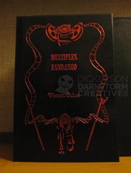
First off, here’s what the actual, real world cover looks like. The photo is courtesy Dark Regions Press.
How did we get all the way there? Here’s how.
First off, Weston and Joe (of Dark Regions) had a pretty good idea going forward. It needed to have an empty central area for text, with art going around it. The Egyptian god Ra needed to be included, and, of course, some indication of film or movies.
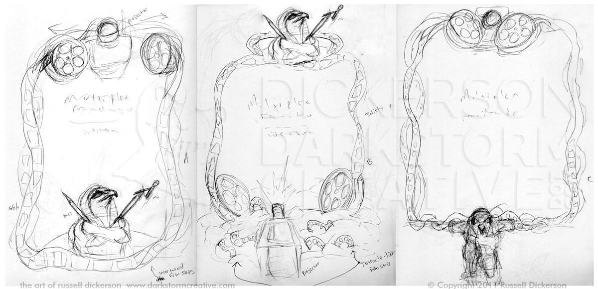
So, I did some rough sketching of the Ra character, more “stream of consciousness” ideas than anything. Then I passed them on (click on the image for a larger version).
Right away, the version on the far right stuck out, as well as #2 with the crossed arms. After some discussion, I went back to the sketchpad and created three rough ideas of what the cover might be (click on the image for a larger version).
In looking at them, “B” might have been a little tricky to pull off. You only get one color to play with, and trying to indicate smoke or fog as it is at the bottom might not work so hot. It’s also a little more disjointed, not as connected as the other two. The crossed arms of Ra look fine, but they aren’t nearly as dramatic as those of Ra in “C”. The camera at the top also connects well with Ra, both visually because they match in size, but also in content. Each item might be releasing or accepting the film flowing around, so they connect well.
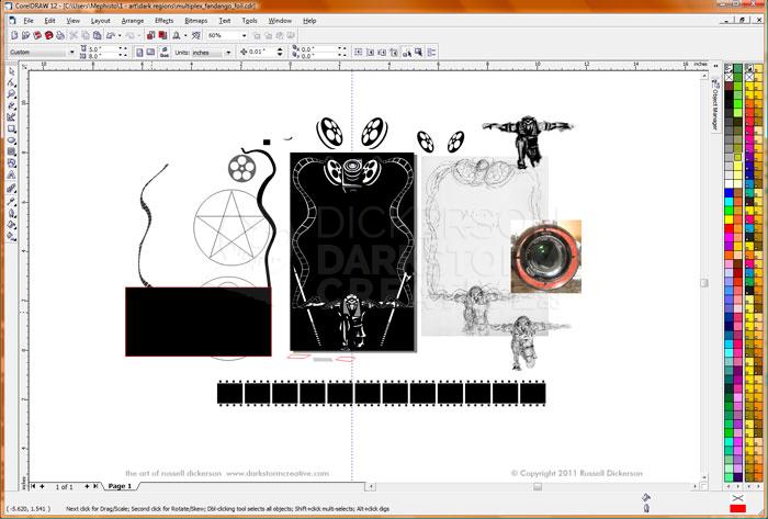
From here, I moved to vector creation. As I mentioned in that previous article, you need to create these stamps with vectors to make them work right. That means lots and lots of parts, and then combining them to make them work right. For example, here’s what the project screen looks like:
The programs (CorelDraw, Adobe Illustrator) allow you to have pieces off of the “page” as it were, which don’t show up in the final art. That’s a great advantage, as I can have reference materials off the page. I can also build some smaller items off of the page, or even duplicate others before a huge change.
Now, you can see there are lots of objects here. But at this distance you can’t really see all them, and in fact there are 1,302 objects on this page. Some of them are huge, like the sketch bitmap on the right. Others are very tiny, like the tiny squares on the film at the bottom of the screen.
You might ask (maybe), why does it look so simple then? It certainly doesn’t look like a thousand pieces.
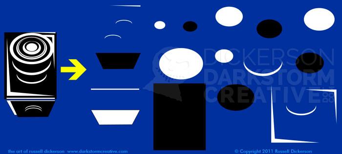
Here’s a good example. Let’s look at the projector at the top of the design. If we were to break it down into the individual parts, here’s what you get:
All those little shapes basically sit on top of one another, giving the illusion of an object and its depth. The shapes are poked and prodded until I can make them look like something other than an ellipse, or a square, or whatever else I’m working with. That procedure is repeated over and over again with all of the objects in the image.
But, this is what you might call the “construction phase”. It’s not final art, because I can’t hand it to the print shop like that. That design is a two-color design (we’re not counting the blue), black and white. So, when they go to try and print it, they are going to get a black plate and a white plate, instead of just one plate to print with. That’s a problem.
So, after all of the editing and proofing are done, I go in and start combining everything together. I only want what is white to show up, black is just the color I’m using to help show where things are at and make them into the proper items. I use the program’s features to combine some items together, cut parts of other objects away, and hopefully in the end I get an entire page of items that are all the same color. It looks kind of like this:
In the first step, we take our objects and tweak them until we only have the one color. From that point, we can make them any single color we want. You can see the “Test” text in the background, to show how this works. Where the black hid the text before, our new set of objects shows the text through it. But we haven’t lost the “highlighted” effect at all.
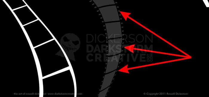
We can go through and combine the rest of the parts in the image together, and it’s also at this point that you can really see how something might work out. Case in point, on the film that goes around the border of the image. Normal film has perforations that run on each side, to help advance the film. While that looks great, and the details are nice, they aren’t going to work here.
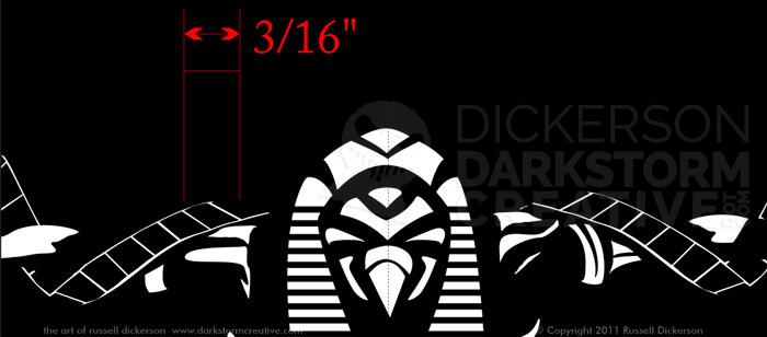
Zooming in on one the curves, you can see how tiny the boxes would really be in the design. Also, when they start wrapping either around Ra or into the film rolls, the strips get smaller and smaller.
For consistency, you’d have to leave them in whether they are large or small. But from a realistic printing standpoint, there’s no way they would work. The stamp, while very accurate, isn’t so accurate that it can reliably do such small points. In some designs, that “filling in” of the art can work fine, no blood no foul. But here, it would have made the film strips look broken, or at worst maybe that it’s printed in a crappy way. As a designer, there’s no way I can let that happen.
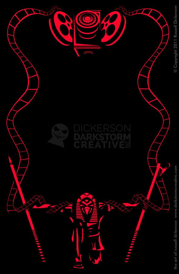
So, I jettisoned all of the squares/perforations, and worked up other areas where the design might be too small. I combined, cut, and edited all of the art back to a single color. Then I saved everything and sent it off to the publisher, and that image at the top of this page is what we get at the end. It’s beautifully reproduced, and I’m happy that I was able to work on the project.
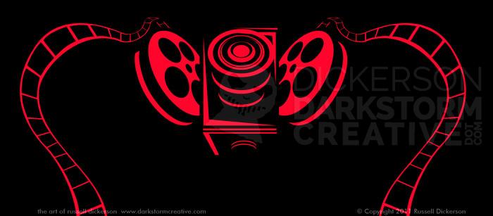
Here’s what the final design looks like, as well as a couple of closeups.
