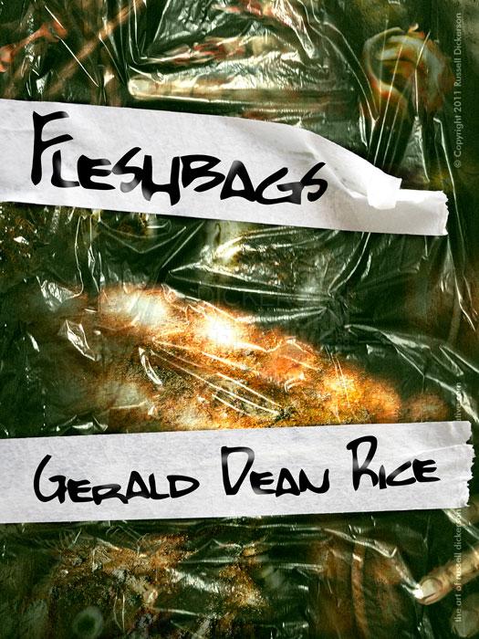
I’ve been busy for some time now, and I haven’t been able to post the newest ebook cover that I created a couple of months back. I thought it was time to show it off, so here it is.
For those that follow this blog (both of you), a few months back I was in the middle of creating a very nice, calm seascape (see it here). I joked on the social networks that, while I was creating this nice art piece, at the same time I was creating what might be my goriest and most horror-filled piece ever.
This is that one.
This the cover I created for author Gerald Rice’s ebook Fleshbags, but first let’s see how it came about.
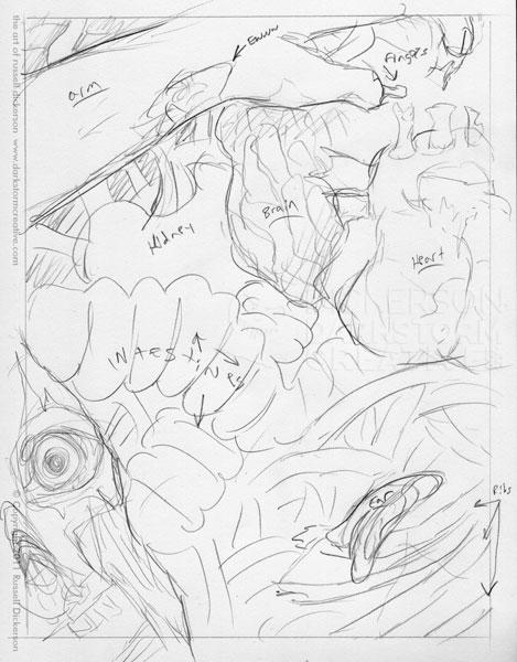
The story revolves around zombie attacks, and a unique sort of bag of skin that each one has at their midsection (hence the title). After a bit of back and forth on sketches (as is the norm), we ended up with a final design, below:
The challenge on this one, aside from avoiding the typical zombie cover, was being accurate with the anatomical pieces that were in the “bag”. Now, as an artist, I’ve studied anatomy for years. But that’s usually the outer anatomy, what you’d see when someone is in front of you, not the insides.
So I did lots of other research, and other sketches of individual parts, before diving into the digital art. I painted each part on screen as it should be, carefully creating an accurate portrayal of the various human parts that would be on the cover.
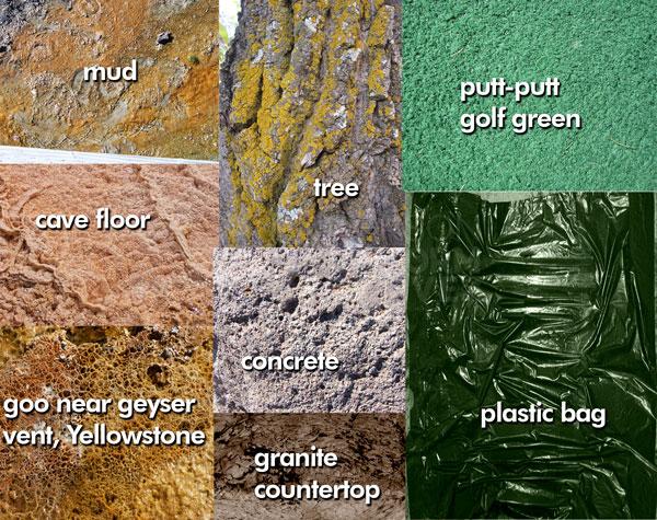
Once that was done, I had a lot of very slick, very smooth looking body parts. In other words, completely unrealistic. So, I turned to some of the many texture files I have on my computer. Here’s a sample of some of them you’ll see in the work:
I also listed what some of those things really are.
Now, the trick here is not just to slap on the photo texture and rock on, because the texture isn’t the end-all-be-all answer to everything. Much like a paintbrush, it’s just a tool. So, I spend a fair amount of time squishing the texture layer, stretching it, masking or deleting parts of it, cloning (and heal brush) it, and even dodging and burning it, to get what I want.
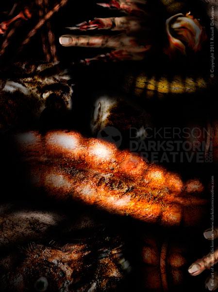
Here’s the art with the textures applied. Note: I used a number of photos as textures, but none of the objects are directly from photos. They were all created by hand with a brush in Photoshop (and shaded), then textures and effects on top.
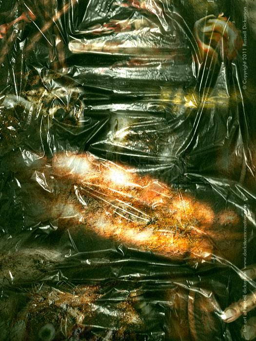
Which just looks like a bunch of parts floating in the air. So, I added a new texture of a plastic bag over the top of all of this, and manipulated it until I liked what it looked like. At the end of that, I changed the layer blending mode in Photoshop to “Hard Light”:
Which gave the overriding plastic bag a transparent, yet still existent, look and feel:
I manipulated the bag texture a bit more, to match where the parts underneath it were a little better. That way, it really looked like those parts were putting pressure on the bag material. Then I adjust the color cast a little bit to give it all a greenish-yellowish hue.
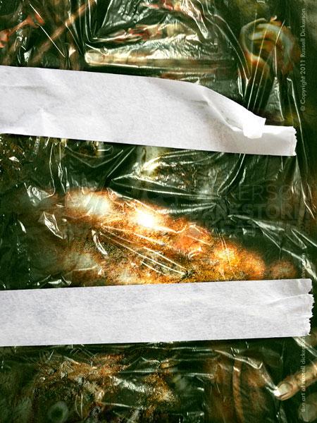
After the actual art was all set, I looked at the best way to put the text of the cover on it. After talking with the author, we ended up with a tape look, as if the parts inside were marked with what they were:
That also took a bit of manipulation and creation, to match the shadows and gaps of the tape with the underlying plastic. It didn’t need to just sit on top, but I had to create an interaction between the tape, the plastic, and the shadows. After that, it was a simple matter of adding the cover text, and highlighting certain areas of the text to match the shadowing of the tape.
Here it is, my final design of the Fleshbags cover. It was a fun challenge, and a good reminder of anatomy (and all its uses).
