This week for Alphabeasts, which I’m now caught up on, I decided to try something different. With my computer being backed up and doing some maintenance, I thought I would try a larger piece than the others have been.
This week’s letter was “R”, and the first thing that popped into my head was “revenant”. Those with a sharp eye might remember a cover I did a couple of years ago, for Brian Keene’s book A Gathering of Crows. That book featured a number of stylized revenants, and I thought this would be a good time to revisit that creature.
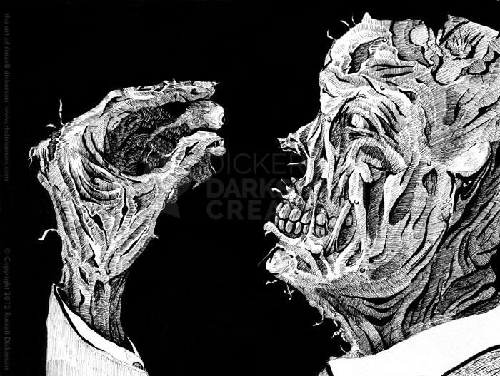
In this case, I’ve reverted back to the traditional idea of a revenant. It’s an undead creature, but unlike the wandering zombie this one has a purpose. A revenant seeks revenge, and comes back looking for it. So, I created an image of a very torn up revenant, finally getting his revenge.
Here is The Revenant, 9″ x 12″ ink on 140 lb. Cold Press. Click on the image for a larger version, and keep reading after the image too.
When I was getting started on it, I decided to try something else differently. I took pictures as I went, and posted the progress on my social media sites. That worked out pretty well, it gave me quick, periodic breaks, and garnered some attention.
Below is my step by step creation of the art, from (nearly) blank page through the final Photoshop adjustments. If that’s not your schtick, then thanks for checking out the art, and let me know what you think of it either below or on my social networks.
Those of you who decided to stay? Here we go.
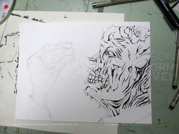
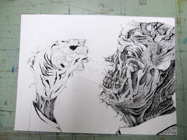
In this first progress shot, you can see the sketch that I’m working off of. It’s done with a 2H pencil, very lightly. Sometimes I just pencil the general framework of where I’m heading. Other times, like this one, I add a little more detail to keep me on track. The inks are done with Micron Pens, mostly 02, but also 03, 05, 08, and a flat 3.
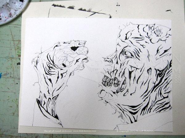
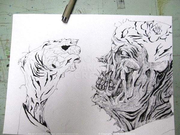
Next, it’s a matter of picking a place to start adding the finer details. In this case, I started with the teeth, and began to work around the image. So it goes from this…
…to this…
…to this…
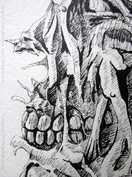
…in an hour or two. Or, as was this case, a few hours, since I was also working on computer maintenance. Here’s a closer look at the face area:
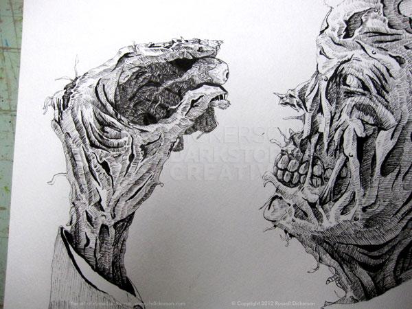
Finally, with the interior of the hand, I’m more or less done with the crosshatching of the lines. I may do back and darken areas here and there, but for the most part I call it done:
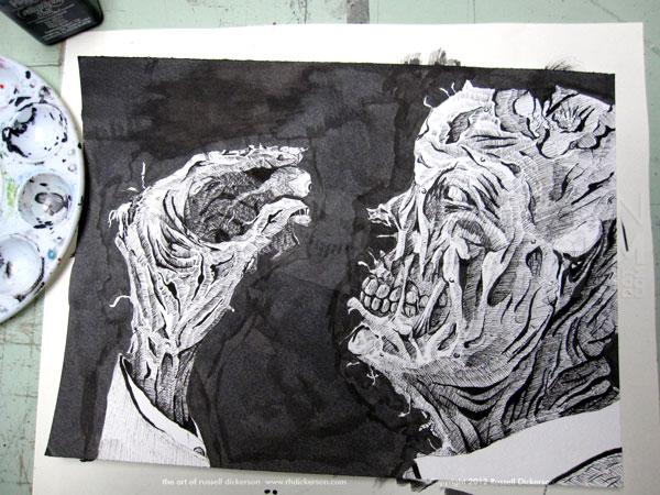
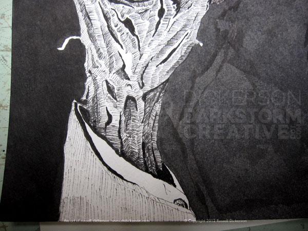
Without the black background, the interior of the hand (and a few other spots) look a little out of place. It doesn’t help that in this photo, the light is coming from a different spot than it is in the image I’m creating. So, I lay down an initial layer of black ink using a brush.
On a smaller ink, such as the 5″ x 7″ size I often do, I usually use a PITT pen brush for this bottom layer. But, I don’t really feel like blowing through an entire pen brush on this larger size, so dipped ink with a brush it is.
Why an “initial” layer and not just the final background? The Cold Press watercolor stock that I use, which I love, sucks in ink like there’s no tomorrow. Which is great, because I tend to use a lot of ink. When I tried Bristol stock years ago, I never liked it because I smeared it all the time. That doesn’t happen with the Cold Press.
The black is similar to an undercoating that you’d do if you were doing a painting with oils or acrylics. You can see, though, that it isn’t going to work like it is. Thus, it’s only an “initial” or base layer.
One thing I will mention though, if this is going straight into the computer, into Photoshop (or whatever), you may not need a top layer of ink. Photoshop should be able to make the darker areas perfectly black with little trouble, and off you go into digital land. Myself, I prefer to completely finish the ink, so that it looks great as a standalone, traditional ink work.
So, after that layer of ink dries, I add the top (and normally final) layer of ink. Notice though in the next picture how the ink looks. To the left of the arm is the final layer, and to the right the original, base layer. The final layer looks decidedly darker, far smoother, and much more consistent.
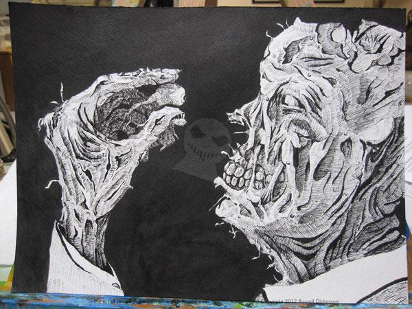
Here’s the final “ink” version, with it’s final layer completed.
Now, after it dries for awhile, I pick up children from school, and so on, it’s ready to scan in. Sadly, being of very little money, I have a smaller scanner. Which, I can’t complain, I do have a scanner, and does a great job. It’s just standard letter size, though, which means some trickery is often involved.
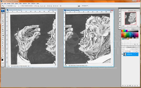
The first thing to do is to go forward, and throw it on the scanner. I scan it in two parts, so in Photoshop I get this:
From here I do two things. First, I pick one or the other, and double its canvas size. Just make sure you’ve already put it on its own layer. Also, when you enlarge the canvas, keep the current part to the left (or right, however you chose it). Once there, the second step is just to use Photoshop’s (CS3) Layer Auto-Align feature. That compares parts of each side (good thing the scans overlapped), and puts them together as if they are one photo:
You may or may not have to fiddle with a few spots along the line that the scans were combined, it differs a bit each time you do it. In this case, I had to make a minor edit at the top and the bottom of the combined line, which used to be in between the face and hand about halfway (already fixed it before the screenshot).
Being the way I am, at this point I save this file and leave it alone. I keep it as an “original scan” file, and resave it to a new file for the final version. That way, if I need to go back for any reason and I’ve screwed up the other one, I have this original scan to work with. If I sell the original art (crossed fingers, want to buy it?), I at least have a good, high res scan to work with.
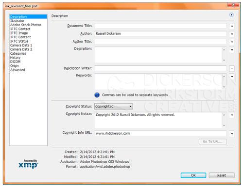
The first thing I do in the new file is open up Photoshop’s “File Info” screen. This screen allows me to add my name, the piece’s title, keywords, and most importantly, copyright information. The File Info screen is great for that, and the information you put here is saved in every iteration of the file past here. It doesn’t matter if it goes to Tif, or Jpeg, or whatever, the information is saved in the EXIF data of the file itself.
I think it’s a smart thing to do, to mark it with your copyright within the file itself. Sure, there are ways around it, just like someone can crop off my visual copyright reference on the the work itself. But it’s an easy thing to put in there, so I do.
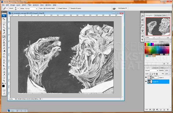
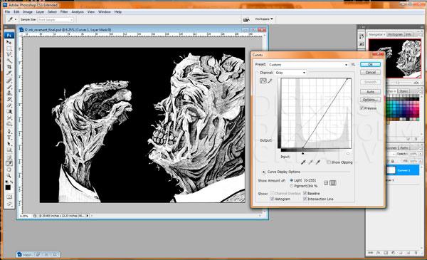
Next, I use an adjustment layer, Curves, to adjust the contrast of the art. That smooths out the black areas considerably, and brightens any leftover grays from the paper itself.
One disadvantage of using Cold Press, over a smoother paper, is that it has a texture to it. That’s great when you are working with it, but when scanning it in that can cause issues. Using Curves is sort of a quick-and-dirty method, and works fine to get rid of much of that for the web. For print, though, I would probably go into a lot more detail with it. That might mean using the Unsharp Mask, or Levels, or even converting to one color through Photoshop’s Bitmap features. It may even mean a little manual touchup here and there.
In this case though, Curves works just fine. Most of the time it’s just dealing with the extents of the curve too, though occasionally I might toy with grays as well:
After this step, I just add my copyright into the file. I keep my copyright line in a separate Photoshop file, saved as a Smart Object, and I just pop it in there where I think it works best. I want to keep it subtle, so I drop the opacity some.
That’s it, now we save to Jpeg, put it at the top of a blog post, and write a horrifically long article about it. Thanks for sticking with me.
