It is a good idea, after an interview or portfolio review, to leave behind some manner of promotional material for yourself. That could be as simple as a business card, or as complex as a brochure. The idea is that the person doing the review will have something to refer to later, hopefully to get back in touch with you for work or a project.
Each of these materials should follow some obvious guidelines, though the design and size of them might dictate how much information you should (or shouldn’t) have on there. If it’s a business card, or example, you just want your most important methods of contact.
I’ve worked clients in the past (I’m looking at you, real estate people) that want, quite literally, every possible number and contact method they can think of on the little 3.5″ x 2″ card. Cell phone, office phone, other office line, fax, email, secondary email, every social media network on the earth, website, company website, blog, company blog, and so many other ridiculous items that the idea of a simple card is murdered quite horrifyingly.
So, keep it simple.
If not simple, just realize what the most important contact information pieces you need on there. Whoever you hand it to is probably confident enough to find another means, if needed.
Now, as an artist and a long-time professional graphic designer, I tend to try to have at least a bit of flair with each of my personal materials. The materials I’m showing below are with that in mind, that I’m trying to sell my abilities to whoever I gave them to. I want to show that I can not only do art, but that I have design capabilities that often work well for the person I’m giving them to.
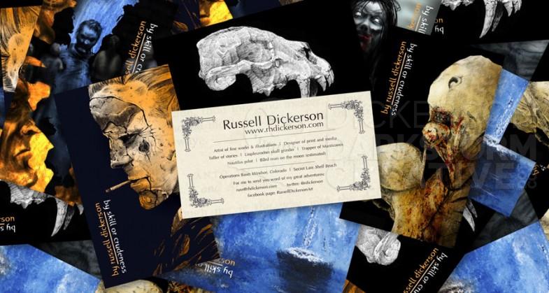
The first piece is the business card, which everyone should have. It’s a quick, generally accepted way to give someone your contact information. I use mine as a small bit of promotion as well, since my art is heavily featured on the front. Click on it for a larger version.
It’s a little hard to read as a Jpeg file, but essentially I have what I feel are the important pieces of information. My email address, main website, Twitter handle, and Facebook page, and, of course, my name. Believe it or not, I have seen cards that downplay the name. It’s the whole reason you have a card, so don’t do that.
Being who I am as a person, I also use some humor on the card. On the front, under my name in the opposite direction, it says, “by skill or crudeness”. “Skill or crudeness” is an anagram of “Russell Dickerson”, which I thought was perfect and a nice conversation piece.
Also on the back, it says this (which is hard to see in the above image):
Artist of fine works & illustrations | Designer of print and media
Teller of stories | Liopleurodon skull grinder | Trapper of Manticores
Nautilus pilot | 63rd man on the moon (estimated)
Operations Base: Windsor, Colorado | Secret Lair: Shell Beach
For me to send you word of my great adventures:
russ@rhdickerson.com twitter: @rdickerson
facebook page: RussellDickersonArt
I feel a bit of humor can go a long way, and lead into a nice conversation. A nice conversation can lead them to remembering you, which is the whole point of promotional materials.
When I had a big portfolio review at the Spectrum Live! Art Show a few years ago, I had the opportunity to get a portfolio review. Other than online and with publishers, which was mostly just looking at my portfolio, Spectrum was the first (and so far only) time that I’ve had a portfolio review with an art director. Not only that, it was with the great Irene Gallo, of Tor Books, so I really wanted to do more than just a business card.
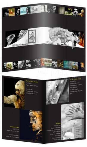
To that end, I created a four page brochure of my work to leave behind. If you have seen my work (go to the galleries here), you can tell that I have a number of different styles. That’s problematic when it comes to promotional materials, you never know what type of image someone will key onto. So a half-page sized, multipage brochure works well for that, allowing decently sized images and enough of them to see my different methods.
Here is the cover (top) and one of the interior pages (bottom) of the brochure. Click on it for a larger version.
The size worked out well, I could show multiple pieces on a page, but still highlight them individually. I had room to add how large each one was, what materials I used if the piece wasn’t digital, and where it was published if relevant.
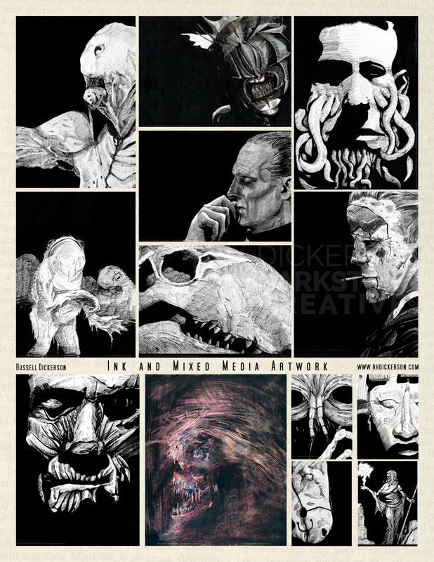
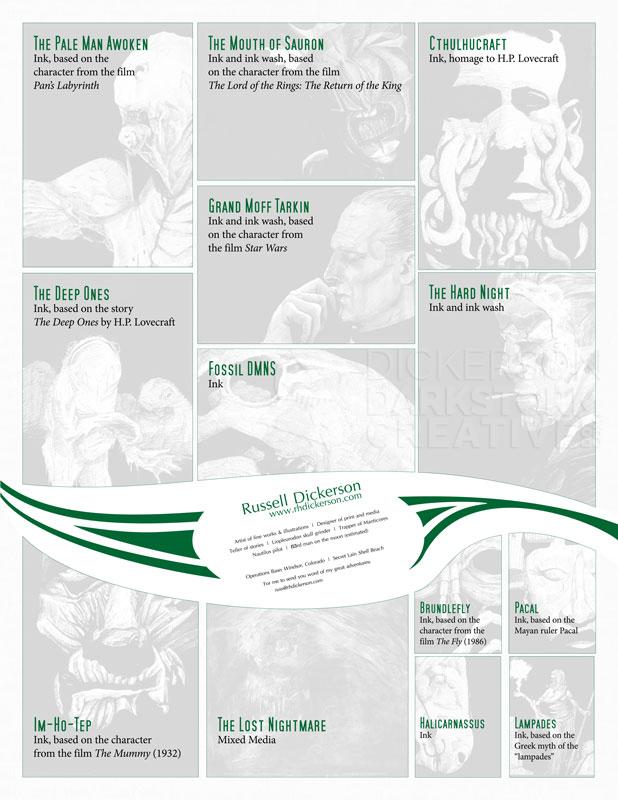
For other events, I tend to hand out letter-size promotional sheets instead. Mostly because it’s easier, since making brochures can be time-consuming and a bit tricky compared to just a double-sided print. At the same time, I can still show my design skills off, in different ways that might not work as well as a brochure.
I do still run into the problem of having different styles, but so far I’ve handled that by creating two different sheets. The first features my digital art, and the other my ink and multimedia work. It takes a bit to pick which ones might be my best, since I’ve been doing this whole art thing for 15 years now. By splitting them, it makes it a little easier to show the best of each category.
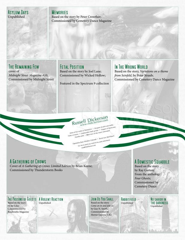
The images below both use a plugin called “Twenty Twenty”. It allows for before and after images (see a literal before and after usage here on my gallery site), but in this case I’m using it to show the back and front of each sheet. I designed the art on the front to show the full piece, and on the back it references, in the same spots, information on each image.
[twentytwenty]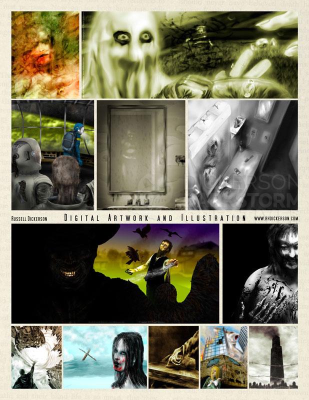
[/twentytwenty]
[twentytwenty]
[/twentytwenty]
