Picture this: there’s a former cop standing in one spot, with a beautiful woman standing behind him. His gun is drawn, and he’s waiting for the bad guy to show himself so they can have a “final showdown”. It’s a tense scene, where quite a lot of bad things are about to happen.
Now, everyone reading this has a different idea of the scene. Some of us grew up on Miami Vice and Magnum P.I., so we could see a similar idea in our heads. Others of us see the action hero, the John McClane with his machine gun loaded and ready to fire.
| Originally written for my monthly blog with Apex Book Company, March 2013 |
But let’s try a simple experiment. I’m going to say one word, and then we’ll see what kind of visual pops into your head. Here we go, read the first paragraph again and then skip to this next word.
Noir.
If you’re like me, that word just triggered an exact image of the paragraph. I see the former cop standing at the window of his office, the strong light from outside the blinds forcing a patterned shadow on him. He’s dressed in his suit, maybe a little dishevelled, and his fedora keeps his look cool. His femme fatale, dark lips and shapely body, waiting behind him. I can’t decide if she’s working with the bad guy or not. The bad guy might burst into the office, or he might just be seen down in the street, I’m waiting to find out with baited breath.
It’s an image that’s ingrained in the heads of a lot of people. Black and white film, high contrast and almost always shot at night, even down to the particular clothes they wear, there are visual markers that tell you right off that this is a noir piece.
But why is that? The visual elements aren’t unique to noir films, in fact some of them are simply that way because of the technology of the times. The clothes are even a sign of their times, and appeared in plenty of non-noir films. So why, when we hear that word, do we get a very distinct visual idea?
Let’s take a look at another experiment. This is a photo of Fred MacMurray, taken around his time on the television show My Three Sons.
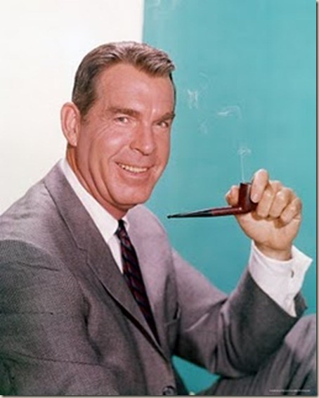
It was a sitcom, and there were lots of jokes and generally good feelings to the whole thing. Looking at the photo above, I can certainly see the happy, level-headed, father of the show. I can also see that it was a fairly laid-back show, something fun to watch.
Here’s a different photo of MacMurray, what do you think?
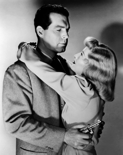
The second I saw it, I had that immediate feeling that this would be from film noir. In fact it is, it’s from the Alfred Hitchcock’s classic film Double Indemnity, one of the hallmarks of noir. But what makes it seem like a noir shot right off the bat? Even without seeing the film, or knowing the story or who the characters are, you immediately get a visual sense that it’s a noir affair.
Let’s examine the photo for evidence (bet you didn’t see that pun coming).
First off, there’s the obvious chiaroscuro feel to the photo. Chiaroscuro is a fancy word we artists like to toss about, as it makes us feel just a bit brighter. It really just means that there’s a high contrast in the image, a strong harsh light forcing deep shadows. It’s very evident here that there is a single, very strong light offscreen, which gives the image a very dramatic sense. It’s something you almost always see in noir works.
Sure, you’ll say that when Double Indemnity was filmed (it came out in 1944) that was the technology they dealt with. There were some color films by that time, but nearly everything was black and white. Even then, the creators of these types of films specifically chose to film them with lower light, high contrast, and a more dramatic feel.
An indicator of a crime drama is also the gun, as well. Not just the gun, but the way he’s holding it too. It shows a comfort with the gun, a man who has used one plenty of times as a part of his life. It’s not very subtle on the surface, of course, a gun as shown really does make you think of crime. But it’s the way it’s being held that shows the character in it.
Suits, and other manner of clothing as well, is also indicative of the noir idea. To be fair, many men wore suits in those times. Noir seems to make this a fact as well, over most other films, in that it’s almost a necessity. It’s used in the story quite a bit, there are plenty of scenes where the men pull their guns out from under them, in a show of both force and finesse.
You might say, “but Russ, all of those things appear in plenty of films”. That’s true, and that’s where the trick comes in. Looking at MacMurray in the first photo, he’s wearing a suit and doesn’t look particularly “noirish”. Thinking back to John MacClane, he has plenty of guns and tries to stop the bad guys, but I don’t think “noir” when watching Die Hard. The harsh, high contrast black and white imagery has been present in horror films since long before Double Indemnity.
Noir imagery really comes down to the right combination of visuals, combinations that you probably won’t see together in other genres of film. The harsh lighting, the light through the blinds, black and white images, even the right clothing, can make us think of noir. The visuals together weave a texture of noir, a visual representation of living the lives of the characters.
It’s a fascinating exploration in why people come to associate certain types of visuals with certain types of stories. Seeing a ringed planet makes us think of science fiction. Seeing a gravestone makes us think of horror.
Seeing the texture of noir, we see the brilliant crime stories laid out before us, and know already what we’re getting into. If only the characters knew.