I’ve always loved this piece by Frank Schoonover, though that can be said for many of the pieces I’ve seen by the artist. He was one of the classic illustrators, and being primarily an illustrator myself it’s easy to see why he’s always been one of my favorites. Hopalong Takes Command is an exceptional example of Schoonover’s wonderful ability to tell a story with a brush.
From the perspective of an artist and art lover, this has everything that makes a piece of art special to me. I love the composition, with everything pointing back to the character and the dark window. The bright highlights throughout the painting push your eye into the darkness of the window, and around the cowboy, giving the viewer a fascinating sense that Hopalong is clearly in the open for everyone to see. But the eye is drawn to the shadows, and in the shadows of his face are the true intentions of the fight in the air.
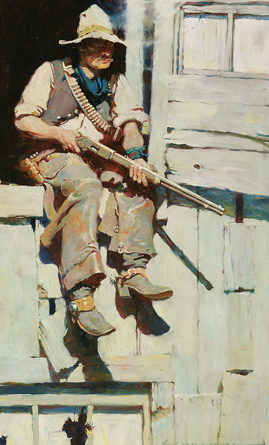
It’s interesting that, much like Edward Hopper, there’s a sense here that something either just happened or is about to happen. There are clearly bullet holes and damage in several spots, so an event definitely occurred. At the same time, Schoonover used his talents to leave the viewer with a sense that, despite those events, something else is about to happen too. Something with a lot of gunplay, a lot of machismo, and plenty of action.
What strikes me though, on seeing a zoomed-in version through Google Arts and Culture, is how little detail Schoonover actually painted in the piece. There seems to be a lot of detail, especially in the small versions easily seen on the internet. But looking at it more closely, it’s easy to see the rough brushstrokes and wide open color mixing that Schoonover actually painted with:
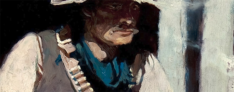
That inference of detail despite the broad strokes fascinates me. Sure, especially as a detailed ink artist, I understand the technique completely. As things get smaller, from the large 30″ by 20″ painting down to a magazine size, it’s going to look wonderfully detailed without the intricate work. It’s an old trick that’s still used today, especially in illustration work.
But I still find the looseness of Schoonover’s brush, at an almost impressionistic level, captivating. He let the viewer fill in the details, giving just enough direction for the viewer to get drawn into the action themselves. That’s exactly what illustrators drive for usually. Not just a scene, or a character, or the setting, but the idea that the art is making the viewer part of the story, something that Schoonover was brilliant at.
For me, though, my favorite part is an artistic one. I love the smudgy look of the smoke to the right of Hopalong’s head. I think of it as a man who was just smoking his cigar, waiting for the time to jump into action. Schoonover painted the arrival of that moment. The cigar is gone, the gun is at the ready, and we, the audience, are waiting anxiously in our front row seat.
See it much larger here.
References
See previous editions and subscribe to new articles here.
Hopalong Takes Command
1905, from “The Fight at Buckskin,” by Clarence Edward Mulford
Outing Magazine, December 1905
Frank Earle Schoonover (1877-1972)
Oil on canvas, 30 x 20 inches
Delaware Art Museum, Bequest of Joseph Bancroft, 1942
http://www.delart.org/collections/american-illustration/hopalong-takes-command/